Better than Paint by Number: How to Pick the Right Interior Color Schemes for Your Home
Looking at interior design magazines, watching home renovation shows, and searching Pinterest have you lusting for a change. You’re tired of the same drab colors painted on your walls.
You try to be adventurous by starting off small. You decide to paint your guest bathroom.
The color doesn’t turn out the way you imagined. It’s even worse than the first color!
Not only that but now your bathroom walls don’t match the theme you’re trying to go for in the rest of your home.
You’re aiming for a dazzling combination of colors like the HGTV Dream Home. There’s a lot of bold choices-black, forest green, rustic orange, and light blue.
How can you develop interior color schemes like the pros?
Keep reading to find out how!
Understand the Effects of Colors
How about a little psychology lesson? More importantly, color psychology-or how color influences our perceptions.
Different colors make us feel different emotions. Take red, for example. It represents excitement and love.
Orange is for enthusiasm and pink is for kindness. While multiple colors represent multiple emotions, you get the idea.
The main takeaway is to understand the kind of feeling you want your home to emit. This sets the tone for your color scheme.
Pick Your Colors
Since we went over the effects of colors, it’s time to pick a few. To do that, let’s go over different schemes you can work off of.
Complementary
On a color wheel, these are the colors that sit opposite of one another. The way for them to work together is to make sure one color is more dominant.
Why?
Complementary colors are richer when paired together. You achieve balance by picking a lighter shade of one.
Monochromatic
If paired colors aren’t your thing, try ones that are monochromatic. This means they’re different shades, tones, and saturation levels from a specific color.
Sticking to two creates a modern, clean look without overwhelming your home.
Split Complementary
For a more daring color scheme, split complementary uses three colors. You choose one main color then the complementary colors of blue are diagonally set.
Sounds confusing, right? It’s really not.
Let’s say you chose blue for your choice. The two colors sitting diagonally across from blue are yellow and orange.
This is a palette you’ll want to use sparingly. Too many colors can wind up looking messy.
How to Apply Your Interior Color Scheme
Now that you’ve selected your colors, it’s time to plan how and where you want to use them. Take a look at our brief tips below.
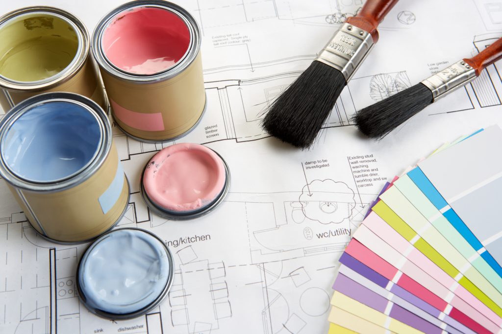
Conduct a Test
Before slabbing paint on every wall, paint a small area first to make sure the color is what you want. Paint chips tend to look a little darker than when applied on an actual wall.
Small Room
If you have rooms that are relatively small, using lighter colors will create the illusion of more space.
Adjacency Matters
Whether your scheme is bold or light, take into consideration adjacent rooms. You don’t want to paint a room bright red and the one adjacent to it is purple.
Keep your palette consistent throughout the house.
Take Your House from Drab to Fab
It’s wondrous what a couple of paint cans can do for a house. Use your interior color scheme wisely as too many colors can be overwhelming. Keep it simple and remember: if you don’t like the first color, just paint over it!
Don’t have the time to paint the house yourself? Check out our interior house painting services today!